

Visual Identity
From logo to typography, business card to screen: we design the visual system that keeps your brand recognisable everywhere, with rules that are easy to apply.
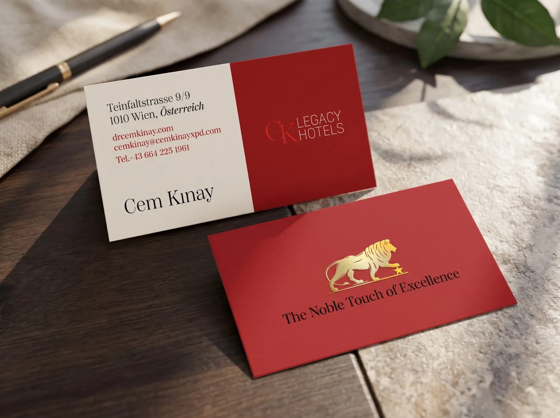
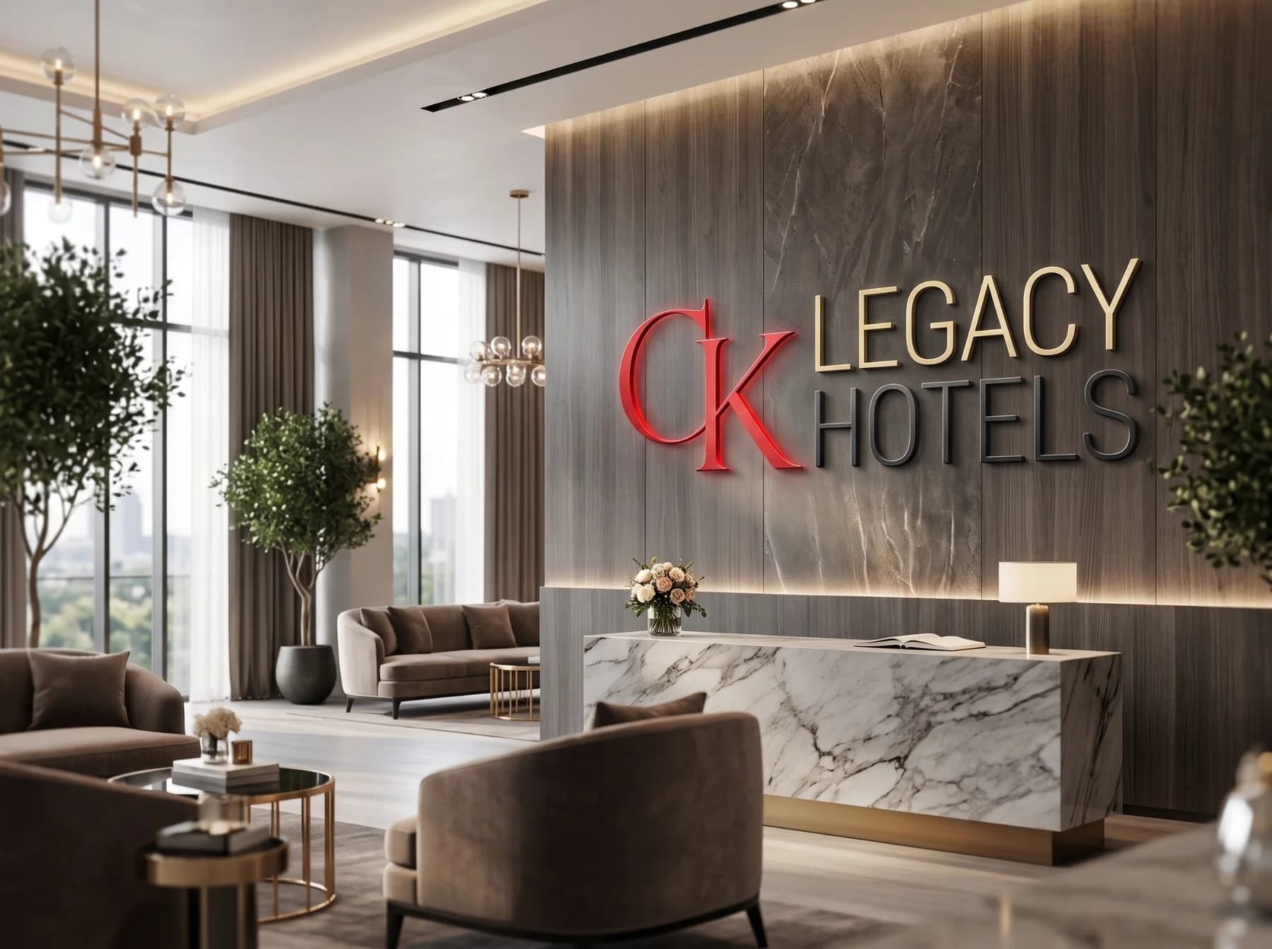
CK Legacy Hotels
Logo, the golden lion emblem "The Noble Touch of Excellence" and business card for CK Legacy Hotels.
Selected identities



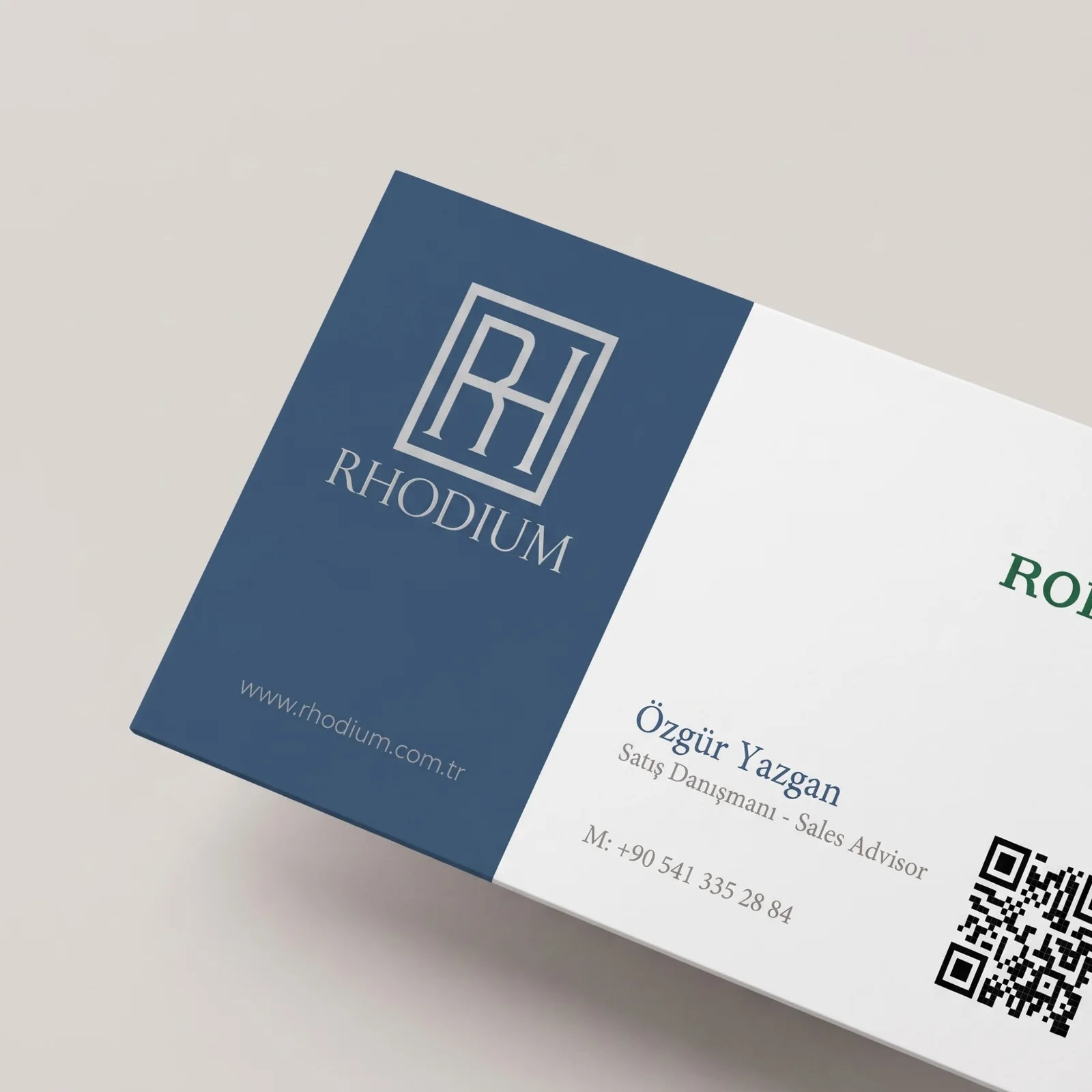
The problem it solves
When an identity passes through many hands, the logo looks different everywhere and the colours shift from screen to screen. Decisions are remade for every design job, and the brand, especially one with many sub-brands or programmes, grows harder to recognise. A visual identity ties the marks that carry the brand's character, and how they are used, into a single system.
Our approach
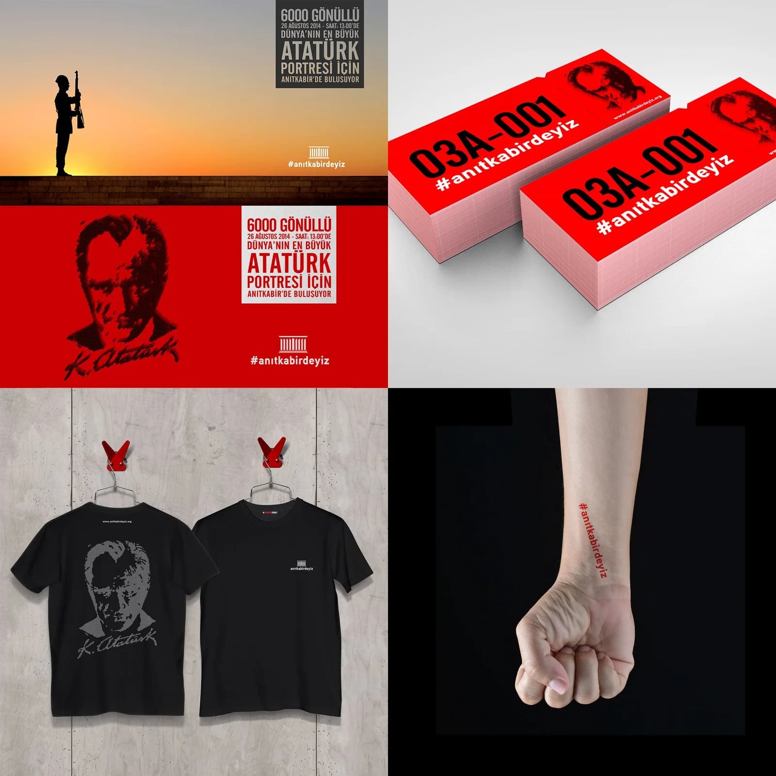
We derive the identity from the strategy: the mark, colours and typefaces should carry what the brand wants to say. In the concept stage AI lets us see more directions in less time and preview applications early; the logo itself is drawn as a vector by a designer and tested at every size. We give sub-brands their own character while setting shared rules that keep the family together, and turn the identity into a guide your team and other agencies can apply easily.
What we deliver
- Logo and, where needed, a monogram or sub-brand logos
- Colour palette, typography and visual language rules
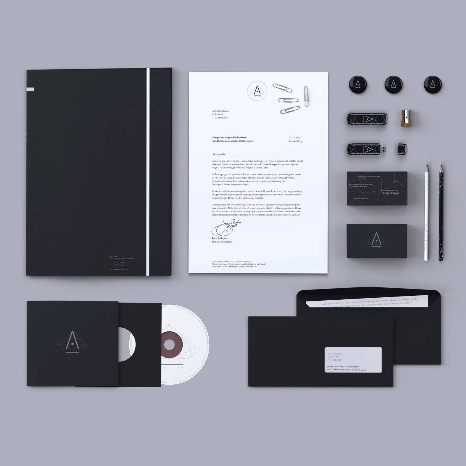
- Business card, letterhead and corporate document designs
- Digital and social media templates
- A brand guide explaining how to use the identity
Frequently asked questions
- Do we have to replace our current logo entirely?
- No. We first assess the value your current identity carries; often a refresh and clear usage rules are enough, and we only recommend a full change when truly needed.
- Is our logo generated by AI?
- No. We use AI in the concept stage for idea and application tests; a designer draws the logo as a vector, and we hand it over with all source files.
- We have several brands or programmes; can you create a shared language?
- Yes. We give each one its own character while shared choices such as colour and type show they belong to the same family. The SUCool programme logos were designed this way.
Thinking about a new identity for your brand?
Let’s build it together, from the logo to print.